前言
ConstraintLayout 是一个使用“相对定位”灵活地确定微件的位置和大小的一个布局,在 2016 年 Google I/O 中面世,它的出现是为了解决开发中过于复杂的页面层级嵌套过多的问题——层级过深会增加绘制界面需要的时间,影响用户体验,以灵活的方式定位和调整小部件。从 Android Studio 2.3 起,创建layout 文件就已经是默认ConstraintLayout 了,但是尽管Google 如此大力推这项技术,但在当时很少有人使用,近些年逐渐被大家拿起来,啊真香!(此处无图胜有图)。目前ConstraintLayout 正式版已经更新至2.0.4 ,本文将带领大家熟悉ConstraintLayout 全部内容。
一. 布局的使用 1.1 位置约束
ConstraintLayout采用方向约束的方式对控件进行定位,至少要保证水平和垂直方向都至少有一个约束才能确定控件的位置
1.1.1 基本方向约束
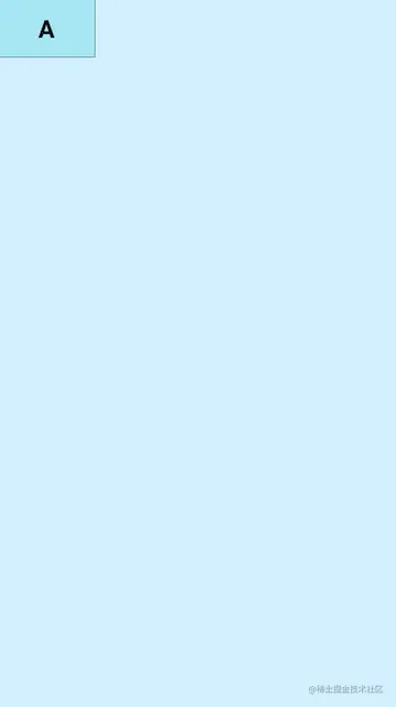
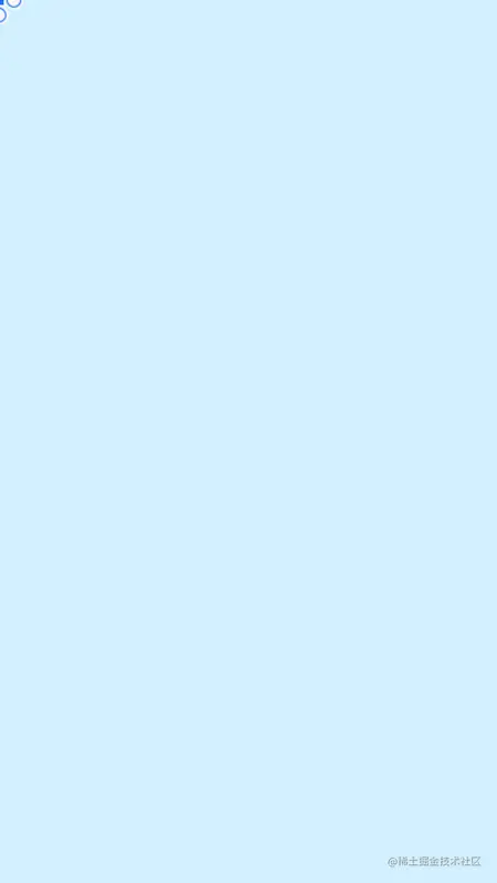
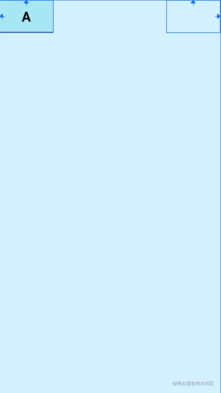
比如我们想实现这个位置,顶部和界面顶部对齐,左部和界面左部对齐:
代码如下:
1
2
3
4
5
6
7
8
9
10
11
12
13
14
15
16
17
18
19
20
21
22
23
<?xml version="1.0" encoding="utf-8" ?> <androidx.constraintlayout.widget.ConstraintLayout xmlns:android ="http://schemas.android.com/apk/res/android" xmlns:app ="http://schemas.android.com/apk/res-auto" xmlns:tools ="http://schemas.android.com/tools" android:layout_width ="match_parent" android:layout_height ="match_parent" android:background ="#DAF3FE" tools:context =".MainActivity" > <TextView android:layout_width ="100dp" android:layout_height ="60dp" android:background ="@drawable/tv_bg" android:gravity ="center" android:text ="A" android:textColor ="@color/black" android:textSize ="25sp" android:textStyle ="bold" app:layout_constraintStart_toStartOf ="parent" app:layout_constraintTop_toTopOf ="parent" tools:ignore ="HardcodedText" /> </androidx.constraintlayout.widget.ConstraintLayout >
核心代码是这两行:
1
2
app:layout_constraintStart_toStartOf="parent" app:layout_constraintTop_toTopOf="parent"
这两行代码的意思就是,控件的开始方向与父容器的开始方向对齐,控件的顶部方向与父容器的顶部方向对齐,其实layout_constraintStart_toStartOf也可以使用layout_constraintLeft_toLeftOf,但是使用start和end来表示左和右是为了考虑别的国家的习惯,有的国家开始方向是右,所以使用start和end可以兼容这种情况。到这里就可以看到该控件使用layout_constraintStart_toStartOf和layout_constraintTop_toTopOf两条约束确定了自己的位置,这里有一个使用技巧,就是,该控件的??方向在哪个控件的??方向,记住这一点就可以了。那么下面就介绍下全部的约束属性:
1 2 3 4 5 6 7 8 9 10 11 12 app:layout_constraintTop_toTopOf="" 我的顶部和谁的顶部对齐 app:layout_constraintBottom_toBottomOf="" 我的底部和谁的底部对齐 app:layout_constraintLeft_toLeftOf="" 我的左边和谁的左边对齐 app:layout_constraintRight_toRightOf="" 我的右边和谁的右边对齐 app:layout_constraintStart_toStartOf="" 我的开始位置和谁的开始位置对齐 app:layout_constraintEnd_toEndOf="" 我的结束位置和谁的结束位置对齐 app:layout_constraintTop_toBottomOf="" 我的顶部位置在谁的底部位置 app:layout_constraintStart_toEndOf="" 我的开始位置在谁的结束为止
那么ConstraintLayout就是使用这些属性来确定控件的位置,虽然比较多,但是有规律可循,没有任何记忆压力
1.1.2 基线对齐
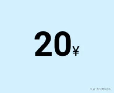
我们看一个场景:
我们有时候需要写这样的需求:两个文本是基线对齐的,那就可以用到我们的一个属性layout_constraintBaseline_toBaselineOf来实现,它的意思就是这个控件的基线与谁的基线对齐,代码如下:
1
2
3
4
5
6
7
8
9
10
11
12
13
14
15
16
17
18
19
20
21
22
23
24
25
26
27
28
29
30
31
32
<?xml version="1.0" encoding="utf-8" ?> <androidx.constraintlayout.widget.ConstraintLayout xmlns:android ="http://schemas.android.com/apk/res/android" xmlns:app ="http://schemas.android.com/apk/res-auto" xmlns:tools ="http://schemas.android.com/tools" android:layout_width ="match_parent" android:layout_height ="match_parent" android:background ="#DAF3FE" tools:context =".MainActivity" tools:ignore ="HardcodedText" > <TextView android:id ="@+id/tv1" android:layout_width ="wrap_content" android:layout_height ="wrap_content" android:text ="20" android:textColor ="@color/black" android:textSize ="50sp" android:textStyle ="bold" app:layout_constraintStart_toStartOf ="parent" app:layout_constraintTop_toTopOf ="parent" /> <TextView android:id ="@+id/tv2" android:layout_width ="wrap_content" android:layout_height ="wrap_content" android:text ="¥" android:textColor ="@color/black" android:textSize ="20sp" app:layout_constraintBaseline_toBaselineOf ="@id/tv1" app:layout_constraintStart_toEndOf ="@id/tv1" /> </androidx.constraintlayout.widget.ConstraintLayout >
通过layout_constraintBaseline_toBaselineOf我们就可以让两个不同大小的文案基线对齐
1.1.3 角度约束
有些时候我们需要一个控件在某个控件的某个角度的位置,那么通过其他的布局其实是不太好实现的,但是ConstraintLayout为我们提供了角度位置相关的属性
1
2
3
app:layout_constraintCircle="" 目标控件id app:layout_constraintCircleAngle="" 对于目标的角度(0-360) app:layout_constraintCircleRadius="" 到目标中心的距离
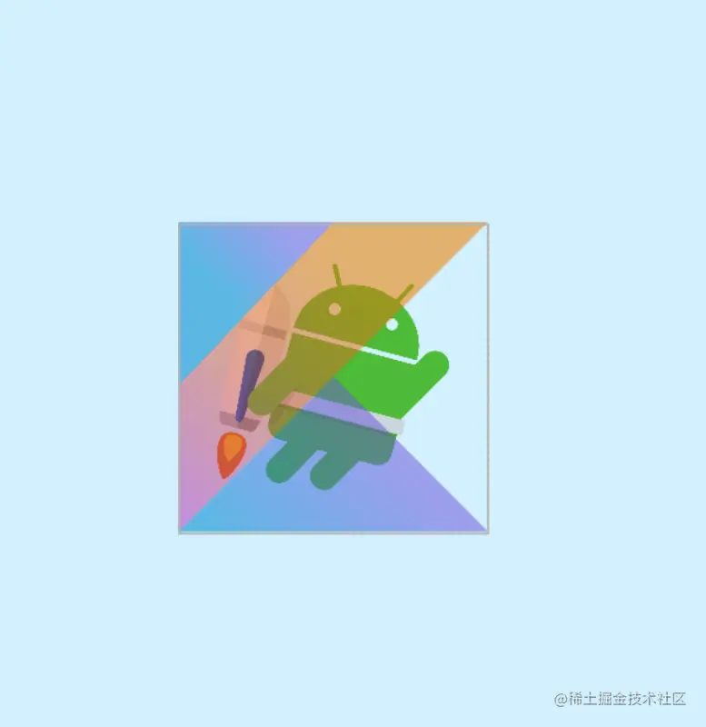
我们来实现一下下图的UI,jetpack图标在android图标的45度方向,距离为60dp
1
2
3
4
5
6
7
8
9
10
11
12
13
14
15
16
17
18
19
20
21
22
23
24
25
26
27
28
29
30
<?xml version="1.0" encoding="utf-8" ?> <androidx.constraintlayout.widget.ConstraintLayout xmlns:android ="http://schemas.android.com/apk/res/android" xmlns:app ="http://schemas.android.com/apk/res-auto" xmlns:tools ="http://schemas.android.com/tools" android:layout_width ="match_parent" android:layout_height ="match_parent" android:background ="#DAF3FE" tools:context =".MainActivity" tools:ignore ="HardcodedText" > <ImageView android:id ="@+id/android" android:layout_width ="100dp" android:layout_height ="100dp" android:src ="@drawable/android" app:layout_constraintBottom_toBottomOf ="parent" app:layout_constraintEnd_toEndOf ="parent" app:layout_constraintStart_toStartOf ="parent" app:layout_constraintTop_toTopOf ="parent" /> <ImageView android:id ="@+id/jetpack" android:layout_width ="60dp" android:layout_height ="60dp" android:src ="@drawable/jetpack" app:layout_constraintCircle ="@+id/android" app:layout_constraintCircleAngle ="45" app:layout_constraintCircleRadius ="70dp" /> </androidx.constraintlayout.widget.ConstraintLayout >
1.1.4 百分比偏移
有的时候我们需要让控件在父布局的水平方向或垂直方向的百分之多少的位置,可以使用如下属性:
1
2
app:layout_constraintHorizontal_bias="" 水平偏移 取值范围是0-1的小数 app:layout_constraintVertical_bias="" 垂直偏移 取值范围是0-1的小数
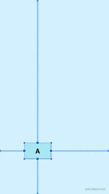
示例:控件A在父布局水平方向偏移0.3(30%),垂直方向偏移0.8(80%)注意 :在使用百分比偏移时,需要指定对应位置的约束条件
1
2
3
4
5
6
7
8
9
10
11
12
13
14
15
16
17
18
19
20
21
22
23
24
25
26
27
<?xml version="1.0" encoding="utf-8" ?> <androidx.constraintlayout.widget.ConstraintLayout xmlns:android ="http://schemas.android.com/apk/res/android" xmlns:app ="http://schemas.android.com/apk/res-auto" xmlns:tools ="http://schemas.android.com/tools" android:layout_width ="match_parent" android:layout_height ="match_parent" android:background ="#DAF3FE" tools:context =".MainActivity" tools:ignore ="HardcodedText" > <TextView android:layout_width ="100dp" android:layout_height ="60dp" android:background ="@drawable/tv_bg" android:gravity ="center" android:text ="A" android:textColor ="@color/black" android:textSize ="25sp" android:textStyle ="bold" app:layout_constraintBottom_toBottomOf ="parent" app:layout_constraintEnd_toEndOf ="parent" app:layout_constraintHorizontal_bias ="0.3" app:layout_constraintStart_toStartOf ="parent" app:layout_constraintTop_toTopOf ="parent" app:layout_constraintVertical_bias ="0.8" /> </androidx.constraintlayout.widget.ConstraintLayout >
1.2 控件内边距、外边距、GONE Margin
ConstraintLayout的内边距和外边距的使用方式其实是和其他布局一致的
1
2
3
4
5
6
7
8
9
10
11
12
13
14
15
16
17
<!-- 外边距 --> android:layout_margin ="0dp" android:layout_marginStart ="0dp" android:layout_marginLeft ="0dp" android:layout_marginTop ="0dp" android:layout_marginEnd ="0dp" android:layout_marginRight ="0dp" android:layout_marginBottom ="0dp" <!-- 内边距 --> android:padding ="0dp" android:paddingStart ="0dp" android:paddingLeft ="0dp" android:paddingTop ="0dp" android:paddingEnd ="0dp" android:paddingRight ="0dp" android:paddingBottom ="0dp"
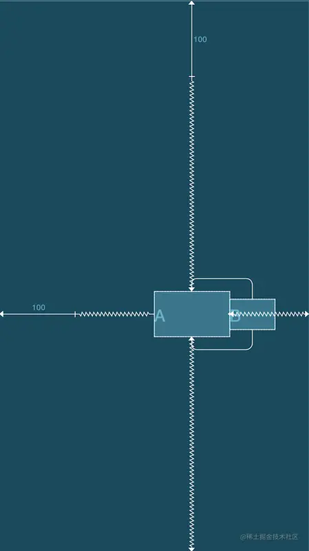
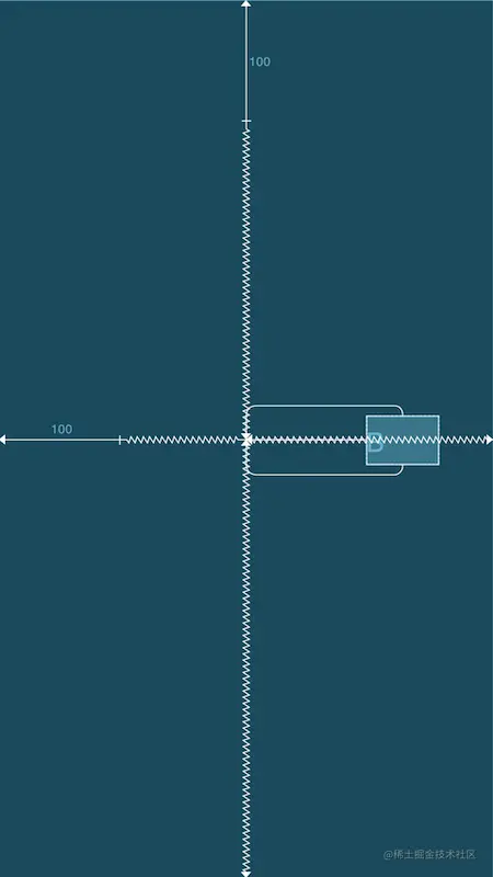
ConstraintLayout除此之外还有GONE Margin,当依赖的目标view隐藏时会生效的属性,例如B被A依赖约束,当B隐藏时B会缩成一个点,自身的margin效果失效,A设置的GONE Margin就会生效,属性如下:
1
2
3
4
5
6
7
<!-- GONE Margin --> app:layout_goneMarginBottom ="0dp" app:layout_goneMarginEnd ="0dp" app:layout_goneMarginLeft ="0dp" app:layout_goneMarginRight ="0dp" app:layout_goneMarginStart ="0dp" app:layout_goneMarginTop ="0dp"
示例:当目标控件是显示的时候GONE Margin不会生效
1
2
3
4
5
6
7
8
9
10
11
12
13
14
15
16
17
18
19
20
21
22
23
24
25
26
27
28
29
30
31
32
33
34
35
36
37
38
39
40
41
42
43
44
<?xml version="1.0" encoding="utf-8" ?> <androidx.constraintlayout.widget.ConstraintLayout xmlns:android ="http://schemas.android.com/apk/res/android" xmlns:app ="http://schemas.android.com/apk/res-auto" xmlns:tools ="http://schemas.android.com/tools" android:layout_width ="match_parent" android:layout_height ="match_parent" android:background ="#DAF3FE" tools:context =".MainActivity" tools:ignore ="HardcodedText" > <TextView android:id ="@+id/A" android:layout_width ="100dp" android:layout_height ="60dp" android:layout_marginStart ="100dp" android:layout_marginTop ="100dp" android:background ="@drawable/tv_bg" android:gravity ="center" android:text ="A" android:textColor ="@color/black" android:textSize ="25sp" android:textStyle ="bold" app:layout_constraintBottom_toBottomOf ="parent" app:layout_constraintEnd_toEndOf ="parent" app:layout_constraintStart_toStartOf ="parent" app:layout_constraintTop_toTopOf ="parent" /> <TextView android:id ="@+id/B" android:layout_width ="60dp" android:layout_height ="40dp" android:background ="@drawable/tv_bg" android:gravity ="center" android:text ="B" android:textColor ="@color/black" android:textSize ="25sp" android:textStyle ="bold" app:layout_constraintBottom_toBottomOf ="@id/A" app:layout_constraintStart_toEndOf ="@id/A" app:layout_constraintTop_toTopOf ="@id/A" app:layout_goneMarginStart ="100dp" /> </androidx.constraintlayout.widget.ConstraintLayout >
当目标A控件隐藏时,B的GONE Margin就会生效
1.3 控件尺寸 1.3.1 尺寸限制
在ConstraintLayout中提供了一些尺寸限制的属性,可以用来限制最大、最小宽高度,这些属性只有在给出的宽度或高度为wrap_content时才会生效,比如想给宽度设置最小或最大值,那宽度就必须设置为wrap_content,这个比较简单就不放示例代码了,具体的属性如下:
1 2 3 4 android:minWidth ="" 设置view的最小宽度 android:minHeight ="" 设置view的最小高度 android:maxWidth ="" 设置view的最大宽度 android:maxHeight ="" 设置view的最大高度
1.3.2 0dp(MATCH_CONSTRAINT)
设置view的大小除了传统的wrap_content、指定尺寸、match_parent外,ConstraintLayout还可以设置为0dp(MATCH_CONSTRAINT),并且0dp的作用会根据设置的类型而产生不同的作用,进行设置类型的属性是layout_constraintWidth_default和layout_constraintHeight_default,取值可为spread、percent、wrap。具体的属性及示例如下:
1 2 app:layout_constraintWidth_default ="spread|percent|wrap" app:layout_constraintHeight_default ="spread|percent|wrap"
1
2
3
4
5
6
7
8
9
10
11
12
13
14
15
16
17
18
19
20
21
22
23
24
25
26
27
28
29
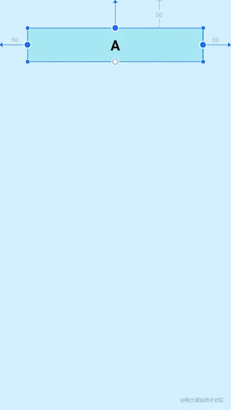
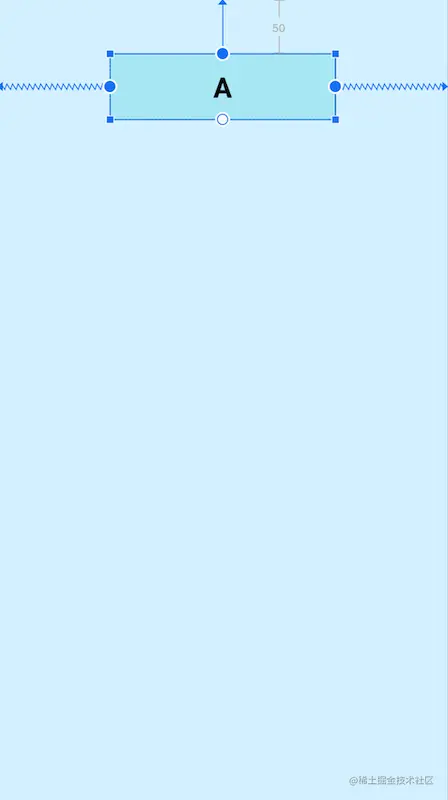
<?xml version="1.0" encoding="utf-8" ?> <androidx.constraintlayout.widget.ConstraintLayout xmlns:android ="http://schemas.android.com/apk/res/android" xmlns:app ="http://schemas.android.com/apk/res-auto" xmlns:tools ="http://schemas.android.com/tools" android:layout_width ="match_parent" android:layout_height ="match_parent" android:background ="#DAF3FE" tools:context =".MainActivity" tools:ignore ="HardcodedText" > <TextView android:id ="@+id/A" android:layout_width ="0dp" android:layout_height ="60dp" android:layout_marginStart ="50dp" android:layout_marginTop ="50dp" android:layout_marginEnd ="50dp" android:background ="@drawable/tv_bg" android:gravity ="center" android:text ="A" android:textColor ="@color/black" android:textSize ="25sp" android:textStyle ="bold" app:layout_constraintEnd_toEndOf ="parent" app:layout_constraintStart_toStartOf ="parent" app:layout_constraintTop_toTopOf ="parent" app:layout_constraintWidth_default ="spread" /> </androidx.constraintlayout.widget.ConstraintLayout >
可以看到,view的宽度适应了所有有效的约束空间,左右留出了margin的设置值50dp,这种效果就就是:自身view的大小充满可以配置的剩余空间,因为左右约束的都是父布局,所以view可配置的空间是整个父布局的宽度,又因为设置了margin,所以会留出margin的大小,因为spread是默认值,所以可以不写 app:layout_constraintWidth_default="spread"。
1
2
3
4
5
6
7
8
9
10
11
12
13
14
15
16
17
18
19
20
21
22
23
24
25
26
27
28
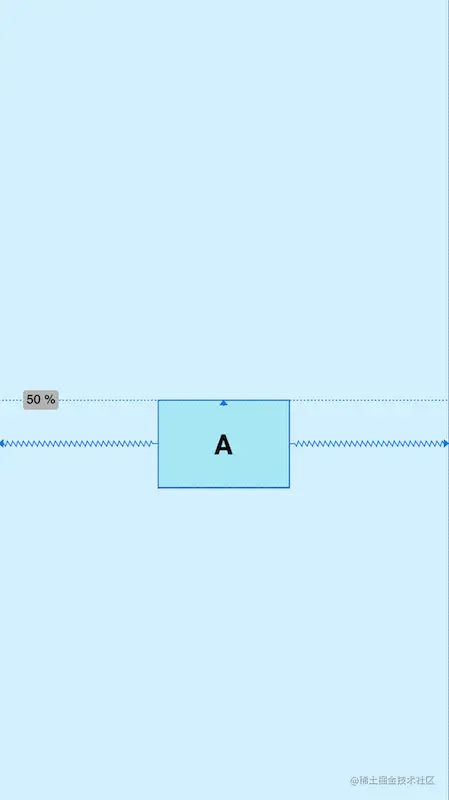
<?xml version="1.0" encoding="utf-8" ?> <androidx.constraintlayout.widget.ConstraintLayout xmlns:android ="http://schemas.android.com/apk/res/android" xmlns:app ="http://schemas.android.com/apk/res-auto" xmlns:tools ="http://schemas.android.com/tools" android:layout_width ="match_parent" android:layout_height ="match_parent" android:background ="#DAF3FE" tools:context =".MainActivity" tools:ignore ="HardcodedText" > <TextView android:id ="@+id/A" android:layout_width ="0dp" android:layout_height ="60dp" android:layout_marginTop ="50dp" android:background ="@drawable/tv_bg" android:gravity ="center" android:text ="A" android:textColor ="@color/black" android:textSize ="25sp" android:textStyle ="bold" app:layout_constraintEnd_toEndOf ="parent" app:layout_constraintStart_toStartOf ="parent" app:layout_constraintTop_toTopOf ="parent" app:layout_constraintWidth_default ="percent" app:layout_constraintWidth_percent ="0.5" /> </androidx.constraintlayout.widget.ConstraintLayout >
percent模式的意思是自身view的尺寸是父布局尺寸的一定比例,上图所展示的是宽度是父布局宽度的0.5(50%,取值是0-1的小数),该模式需要配合layout_constraintWidth_percent使用,但是写了layout_constraintWidth_percent后,layout_constraintWidth_default="percent"其实就可以省略掉了。
1
2
3
4
5
6
7
8
9
10
11
12
13
14
15
16
17
18
19
20
21
22
23
24
25
26
27
28
29
30
31
32
33
34
35
36
37
38
39
40
41
42
43
44
45
46
47
48
49
<?xml version="1.0" encoding="utf-8" ?> <androidx.constraintlayout.widget.ConstraintLayout xmlns:android ="http://schemas.android.com/apk/res/android" xmlns:app ="http://schemas.android.com/apk/res-auto" xmlns:tools ="http://schemas.android.com/tools" android:layout_width ="match_parent" android:layout_height ="match_parent" android:background ="#DAF3FE" tools:context =".MainActivity" tools:ignore ="HardcodedText" > <TextView android:id ="@+id/A" android:layout_width ="wrap_content" android:layout_height ="60dp" android:layout_marginStart ="100dp" android:layout_marginTop ="50dp" android:layout_marginEnd ="100dp" android:background ="@drawable/tv_bg" android:gravity ="center" android:text ="AAAAAAAAAAAAAAAAAA" android:textColor ="@color/black" android:textSize ="25sp" android:textStyle ="bold" app:layout_constraintEnd_toEndOf ="parent" app:layout_constraintStart_toStartOf ="parent" app:layout_constraintTop_toTopOf ="parent" app:layout_constraintWidth_default ="spread" /> <TextView android:id ="@+id/B" android:layout_width ="0dp" android:layout_height ="60dp" android:layout_marginStart ="100dp" android:layout_marginTop ="150dp" android:layout_marginEnd ="100dp" android:background ="@drawable/tv_bg" android:gravity ="center" android:text ="BBBBBBBBBBBBBBBBBBBBBBB" android:textColor ="@color/black" android:textSize ="25sp" android:textStyle ="bold" app:layout_constraintEnd_toEndOf ="parent" app:layout_constraintStart_toStartOf ="parent" app:layout_constraintTop_toTopOf ="parent" app:layout_constraintWidth_default ="wrap" /> </androidx.constraintlayout.widget.ConstraintLayout >
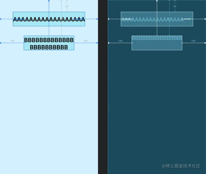
这里写了两个控件作为对比,控件A宽度设置为wrap_content,宽度适应内容大小,并且设置了margin,但是显然宽度已经超过margin的设置值了,而控件B宽度设置为0dp wrap模式,宽度适应内容大小,并且不会超过margin的设置值,也就是不会超过约束限制,这就是这两者的区别。Google还提供了两个属性用于强制约束:
1 2 3 app:layout_constrainedWidth="true|false" app:layout_constrainedHeight="true|false"
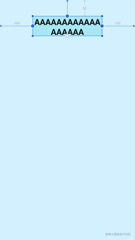
还是上一个例子,这里将控件A设置了强制约束,展示出的效果和控件B是一样的了:
1
2
3
4
5
6
7
8
9
10
11
12
13
14
15
16
17
18
19
20
21
22
23
24
25
26
27
28
29
30
<?xml version="1.0" encoding="utf-8" ?> <androidx.constraintlayout.widget.ConstraintLayout xmlns:android ="http://schemas.android.com/apk/res/android" xmlns:app ="http://schemas.android.com/apk/res-auto" xmlns:tools ="http://schemas.android.com/tools" android:layout_width ="match_parent" android:layout_height ="match_parent" android:background ="#DAF3FE" tools:context =".MainActivity" tools:ignore ="HardcodedText" > <TextView android:id ="@+id/A" android:layout_width ="wrap_content" android:layout_height ="60dp" android:layout_marginStart ="100dp" android:layout_marginTop ="50dp" android:layout_marginEnd ="100dp" android:background ="@drawable/tv_bg" android:gravity ="center" android:text ="AAAAAAAAAAAAAAAAAA" android:textColor ="@color/black" android:textSize ="25sp" android:textStyle ="bold" app:layout_constrainedWidth ="true" app:layout_constraintEnd_toEndOf ="parent" app:layout_constraintStart_toStartOf ="parent" app:layout_constraintTop_toTopOf ="parent" app:layout_constraintWidth_default ="spread" /> </androidx.constraintlayout.widget.ConstraintLayout >
除此之外,0dp还有一些其他的独特属性用于设置尺寸的大小限制
1 2 3 4 app:layout_constraintWidth_min ="" 0 dp下,宽度的最小值 app:layout_constraintHeight_min ="" 0 dp下,高度的最小值 app:layout_constraintWidth_max ="" 0 dp下,宽度的最大值 app:layout_constraintHeight_max ="" 0 dp下,高度的最大值
1.3.3 比例宽高(Ratio)
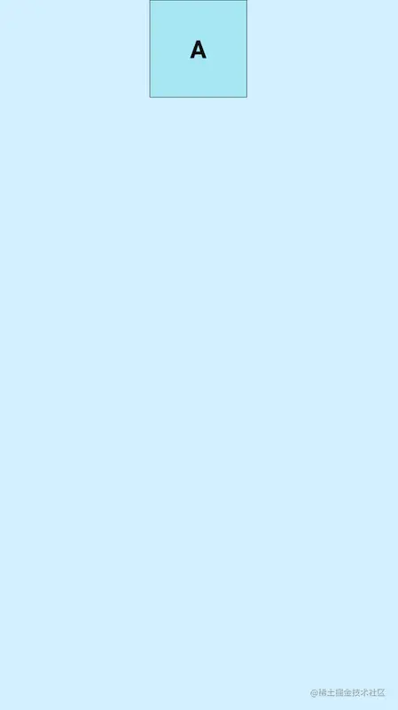
ConstraintLayout中可以对宽高设置比例,前提是至少有一个约束维度设置为0dp,这样比例才会生效,该属性可使用两种设置:
1 app:layout_constraintDimensionRatio ="" 宽高比例
1
2
3
4
5
6
7
8
9
10
11
12
13
14
15
16
17
18
19
20
21
22
23
24
25
26
<?xml version="1.0" encoding="utf-8" ?> <androidx.constraintlayout.widget.ConstraintLayout xmlns:android ="http://schemas.android.com/apk/res/android" xmlns:app ="http://schemas.android.com/apk/res-auto" xmlns:tools ="http://schemas.android.com/tools" android:layout_width ="match_parent" android:layout_height ="match_parent" android:background ="#DAF3FE" tools:context =".MainActivity" tools:ignore ="HardcodedText" > <TextView android:id ="@+id/A" android:layout_width ="0dp" android:layout_height ="100dp" android:background ="@drawable/tv_bg" android:gravity ="center" android:text ="A" android:textColor ="@color/black" android:textSize ="25sp" android:textStyle ="bold" app:layout_constraintDimensionRatio ="1:1" app:layout_constraintEnd_toEndOf ="parent" app:layout_constraintStart_toStartOf ="parent" app:layout_constraintTop_toTopOf ="parent" /> </androidx.constraintlayout.widget.ConstraintLayout >
1.4 Chains(链)
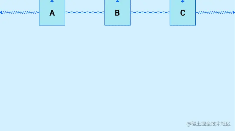
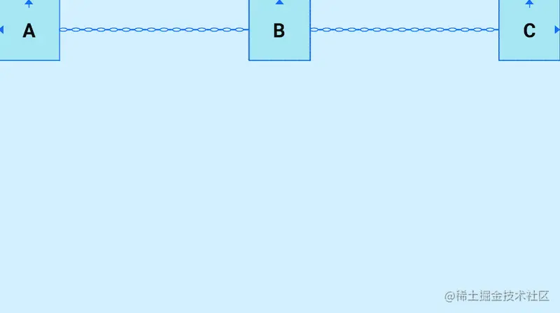
Chains(链)也是一个非常好用的特性,它是将许多个控件在水平或者垂直方向,形成一条链,用于平衡这些控件的位置,那么如何形成一条链呢?形成一条链要求链中的控件在水平或者垂直方向,首尾互相约束,这样就可以形成一条链,水平方向互相约束形成的就是一条水平链,反之则是垂直链,下面看示例:
1
2
3
4
5
6
7
8
9
10
11
12
13
14
15
16
17
18
19
20
21
22
23
24
25
26
27
28
29
30
31
32
33
34
35
36
37
38
39
40
41
42
43
44
45
46
47
48
49
50
51
52
53
54
<?xml version="1.0" encoding="utf-8" ?> <androidx.constraintlayout.widget.ConstraintLayout xmlns:android ="http://schemas.android.com/apk/res/android" xmlns:app ="http://schemas.android.com/apk/res-auto" xmlns:tools ="http://schemas.android.com/tools" android:layout_width ="match_parent" android:layout_height ="match_parent" android:background ="#DAF3FE" tools:context =".MainActivity" tools:ignore ="HardcodedText" > <TextView android:id ="@+id/A" android:layout_width ="80dp" android:layout_height ="80dp" android:background ="@drawable/tv_bg" android:gravity ="center" android:text ="A" android:textColor ="@color/black" android:textSize ="25sp" android:textStyle ="bold" app:layout_constraintEnd_toStartOf ="@id/B" app:layout_constraintHorizontal_chainStyle ="spread" app:layout_constraintStart_toStartOf ="parent" app:layout_constraintTop_toTopOf ="parent" /> <TextView android:id ="@+id/B" android:layout_width ="80dp" android:layout_height ="80dp" android:background ="@drawable/tv_bg" android:gravity ="center" android:text ="B" android:textColor ="@color/black" android:textSize ="25sp" android:textStyle ="bold" app:layout_constraintEnd_toStartOf ="@id/C" app:layout_constraintStart_toEndOf ="@id/A" app:layout_constraintTop_toTopOf ="parent" /> <TextView android:id ="@+id/C" android:layout_width ="80dp" android:layout_height ="80dp" android:background ="@drawable/tv_bg" android:gravity ="center" android:text ="C" android:textColor ="@color/black" android:textSize ="25sp" android:textStyle ="bold" app:layout_constraintEnd_toEndOf ="parent" app:layout_constraintStart_toEndOf ="@id/B" app:layout_constraintTop_toTopOf ="parent" /> </androidx.constraintlayout.widget.ConstraintLayout >
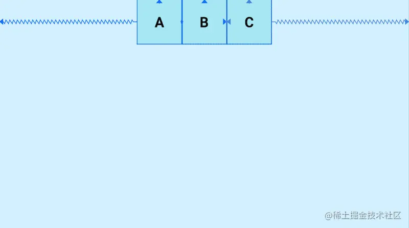
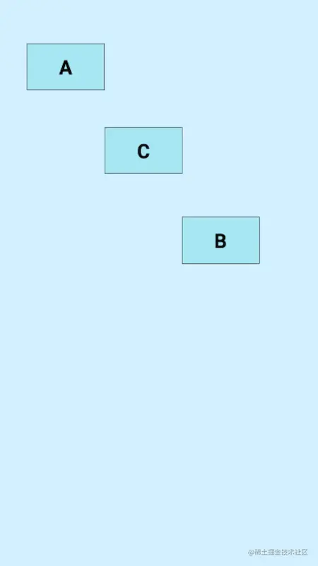
A、B、C,三个控件在水平方向上首尾互相约束,这样就形成了一条水平链,他们默认的模式是spread,均分剩余空间,我们可以使用layout_constraintHorizontal_chainStyle和layout_constraintVertical_chainStyle分别对水平和垂直链设置模式,模式可选的值有:spread、packed、spread_inside
spread_inside :两侧的控件贴近两边,剩余的控件均分剩余空间
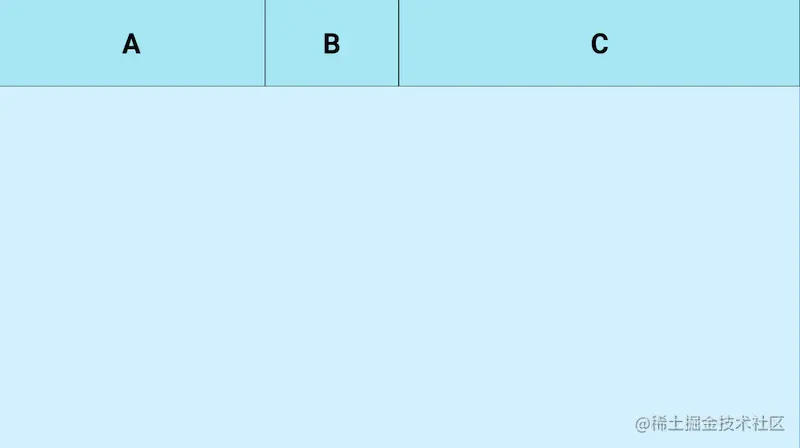
Chains(链)还支持weight(权重)的配置,使用layout_constraintHorizontal_weight和layout_constraintVertical_weight进行设置链元素的权重
1
2
3
4
5
6
7
8
9
10
11
12
13
14
15
16
17
18
19
20
21
22
23
24
25
26
27
28
29
30
31
32
33
34
35
36
37
38
39
40
41
42
43
44
45
46
47
48
49
50
51
52
53
54
55
56
57
<?xml version="1.0" encoding="utf-8" ?> <androidx.constraintlayout.widget.ConstraintLayout xmlns:android ="http://schemas.android.com/apk/res/android" xmlns:app ="http://schemas.android.com/apk/res-auto" xmlns:tools ="http://schemas.android.com/tools" android:layout_width ="match_parent" android:layout_height ="match_parent" android:background ="#DAF3FE" tools:context =".MainActivity" tools:ignore ="HardcodedText" > <TextView android:id ="@+id/A" android:layout_width ="0dp" android:layout_height ="80dp" android:background ="@drawable/tv_bg" android:gravity ="center" android:text ="A" android:textColor ="@color/black" android:textSize ="25sp" android:textStyle ="bold" app:layout_constraintEnd_toStartOf ="@id/B" app:layout_constraintHorizontal_weight ="2" app:layout_constraintStart_toStartOf ="parent" app:layout_constraintTop_toTopOf ="parent" app:layout_constraintVertical_chainStyle ="packed" /> <TextView android:id ="@+id/B" android:layout_width ="0dp" android:layout_height ="80dp" android:background ="@drawable/tv_bg" android:gravity ="center" android:text ="B" android:textColor ="@color/black" android:textSize ="25sp" android:textStyle ="bold" app:layout_constraintEnd_toStartOf ="@id/C" app:layout_constraintHorizontal_weight ="1" app:layout_constraintStart_toEndOf ="@id/A" app:layout_constraintTop_toTopOf ="parent" /> <TextView android:id ="@+id/C" android:layout_width ="0dp" android:layout_height ="80dp" android:background ="@drawable/tv_bg" android:gravity ="center" android:text ="C" android:textColor ="@color/black" android:textSize ="25sp" android:textStyle ="bold" app:layout_constraintEnd_toEndOf ="parent" app:layout_constraintHorizontal_weight ="3" app:layout_constraintStart_toEndOf ="@id/B" app:layout_constraintTop_toTopOf ="parent" /> </androidx.constraintlayout.widget.ConstraintLayout >
二. 辅助类
ConstraintLayout为了解决嵌套问题还提供了一系列的辅助控件帮助开发者布局,这些工具十分的方便,我在日常开发工作中也是使用的非常频繁
2.1 Guideline(参考线)
Guideline是一条参考线,可以帮助开发者进行辅助定位,并且实际上它并不会真正显示在布局中,像是数学几何中的辅助线一样,使用起来十分方便,出场率很高,Guideline也可以用来做一些百分比分割之类的需求,有着很好的屏幕适配效果,Guideline有水平和垂直方向之分,位置可以使用针对父级的百分比或者针对父级位置的距离
1 2 3 4 android:orientation ="horizontal|vertical" 辅助线的对齐方式 app:layout_constraintGuide_percent ="0-1" 距离父级宽度或高度的百分比(小数形式) app:layout_constraintGuide_begin ="" 距离父级起始位置的距离(左侧或顶部) app:layout_constraintGuide_end ="" 距离父级结束位置的距离(右侧或底部)
1
2
3
4
5
6
7
8
9
10
11
12
13
14
15
16
17
18
19
20
21
22
23
24
25
26
27
28
29
30
31
32
<?xml version="1.0" encoding="utf-8" ?> <androidx.constraintlayout.widget.ConstraintLayout xmlns:android ="http://schemas.android.com/apk/res/android" xmlns:app ="http://schemas.android.com/apk/res-auto" xmlns:tools ="http://schemas.android.com/tools" android:layout_width ="match_parent" android:layout_height ="match_parent" android:background ="#DAF3FE" tools:context =".MainActivity" tools:ignore ="HardcodedText" > <androidx.constraintlayout.widget.Guideline android:id ="@+id/Guideline" android:layout_width ="wrap_content" android:layout_height ="wrap_content" android:orientation ="horizontal" app:layout_constraintGuide_percent ="0.5" /> <TextView android:id ="@+id/A" android:layout_width ="120dp" android:layout_height ="80dp" android:background ="@drawable/tv_bg" android:gravity ="center" android:text ="A" android:textColor ="@color/black" android:textSize ="25sp" android:textStyle ="bold" app:layout_constraintEnd_toEndOf ="parent" app:layout_constraintStart_toStartOf ="parent" app:layout_constraintTop_toTopOf ="@id/Guideline" /> </androidx.constraintlayout.widget.ConstraintLayout >
上图中设置了一条水平方向位置在父级垂直方向0.5(50%)的Guideline,控件A的顶部依赖于Guideline,这样无论布局如何更改,Guideline的位置始终都会是父级垂直方向50%的位置,控件A的位置也不会偏离预设
2.2 Barrier(屏障)
这个Barrier和Guideline一样,也不会实际出现在布局中,它的作用如同其名,形成一个屏障、障碍,使用也非常多。这里借助constraintlayout网站 来讲解Barrier。
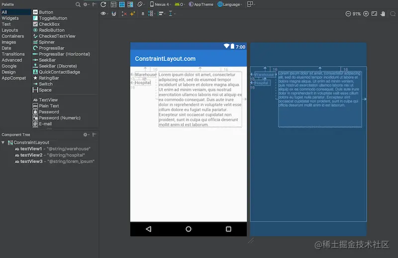
这里有三个文本视图:左边的textView1和textView2;右边的textView3。textView3被限制在textView1的末尾,这工作得很好——它完全根据我们需要来定位和大小textView3。
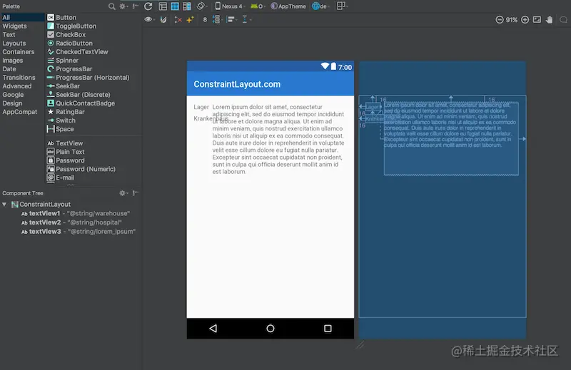
然而,如果我们需要支持多种语言,事情会变得更加复杂。如果我们添加德语翻译,那么我们就会遇到一个问题,因为在英文版本中,textView1中的文本比textView2中的文本长,而在德语中,textView2中的文本比textView1长:
这里的问题在于textView3仍然是相对于textView1的,所以textView2直接插入了textView3中。在设计视图里看起来更明显(白色背景的那个)。比较直接的解决办法是使用TableLayout,或者把 textView1 & textView2 包裹在一个垂直的,android:layout_width="wrap_content" 的 LinearLayout中。然后让textView3约束在这个LinearLayout的后面。但是我们有更好的办法:Barriers。Barriers的配置属性如下:
1 2 3 4 5 app:barrierDirection="top|bottom|left|right|start|end" app:constraint_referenced_ids="id,id"
修改过后的代码如下:
1
2
3
4
5
6
7
8
9
10
11
12
13
14
15
16
17
18
19
20
21
22
23
24
25
26
27
28
29
30
31
32
33
34
35
36
37
38
39
40
41
42
43
44
<?xml version="1.0" encoding="utf-8" ?> <androidx.constraintlayout.widget.ConstraintLayout xmlns:android ="http://schemas.android.com/apk/res/android" xmlns:app ="http://schemas.android.com/apk/res-auto" android:layout_width ="match_parent" android:layout_height ="match_parent" > <TextView android:id ="@+id/textView1" android:layout_width ="wrap_content" android:layout_height ="wrap_content" android:layout_marginStart ="16dp" android:layout_marginTop ="16dp" android:text ="@string/warehouse" app:layout_constraintStart_toStartOf ="parent" app:layout_constraintTop_toTopOf ="parent" /> <TextView android:id ="@+id/textView2" android:layout_width ="wrap_content" android:layout_height ="wrap_content" android:layout_marginStart ="16dp" android:layout_marginTop ="8dp" android:text ="@string/hospital" app:layout_constraintStart_toStartOf ="parent" app:layout_constraintTop_toBottomOf ="@+id/textView1" /> <androidx.constraintlayout.widget.Barrier android:id ="@+id/barrier7" android:layout_width ="wrap_content" android:layout_height ="wrap_content" app:barrierDirection ="end" app:constraint_referenced_ids ="textView2,textView1" /> <TextView android:id ="@+id/textView3" android:layout_width ="0dp" android:layout_height ="wrap_content" android:layout_marginStart ="8dp" android:text ="@string/lorem_ipsum" app:layout_constraintStart_toEndOf ="@+id/barrier7" app:layout_constraintTop_toTopOf ="parent" /> </androidx.constraintlayout.widget.ConstraintLayout >
效果:

为了看到整体的效果,可以切换语言,此时你会看到Barrier会自动位于较宽的那个textView后面,也就间接让textView3也位于了正确的位置。
上述例子是直接使用的constraintlayout网站 中的例子,可以直接访问链接进行查看。
2.3 Group(组)
工作当中常常会有很多个控件同时隐藏或者显示的场景,传统做法要么是进行嵌套,对父布局进行隐藏或显示,要么就是一个一个设置,这显然都不是很好的办法,ConstraintLayout中的Group就是来解决这个问题的。Group的作用就是可以对一组控件同时隐藏或显示,没有其他的作用,它的属性如下:
1 app:constraint_referenced_ids ="id,id" 加入组的控件id
示例:
1
2
3
4
5
6
7
8
9
10
11
12
13
14
15
16
17
18
19
20
21
22
23
24
25
26
27
28
29
30
31
32
33
34
35
36
37
38
39
40
41
42
43
44
45
46
47
48
49
50
51
52
53
54
55
56
57
58
59
60
61
62
63
64
65
<?xml version="1.0" encoding="utf-8" ?> <androidx.constraintlayout.widget.ConstraintLayout xmlns:android ="http://schemas.android.com/apk/res/android" xmlns:app ="http://schemas.android.com/apk/res-auto" xmlns:tools ="http://schemas.android.com/tools" android:layout_width ="match_parent" android:layout_height ="match_parent" android:background ="#DAF3FE" tools:context =".MainActivity" tools:ignore ="HardcodedText" > <TextView android:id ="@+id/A" android:layout_width ="100dp" android:layout_height ="60dp" android:layout_marginTop ="56dp" android:background ="@drawable/tv_bg" android:gravity ="center" android:text ="A" android:textColor ="@color/black" android:textSize ="25sp" android:textStyle ="bold" app:layout_constraintEnd_toEndOf ="parent" app:layout_constraintHorizontal_bias ="0.115" app:layout_constraintStart_toStartOf ="parent" app:layout_constraintTop_toTopOf ="parent" /> <TextView android:id ="@+id/B" android:layout_width ="100dp" android:layout_height ="60dp" android:layout_marginTop ="280dp" android:background ="@drawable/tv_bg" android:gravity ="center" android:text ="B" android:textColor ="@color/black" android:textSize ="25sp" android:textStyle ="bold" app:layout_constraintEnd_toEndOf ="parent" app:layout_constraintHorizontal_bias ="0.758" app:layout_constraintStart_toStartOf ="parent" app:layout_constraintTop_toTopOf ="parent" /> <TextView android:id ="@+id/C" android:layout_width ="100dp" android:layout_height ="60dp" android:layout_marginTop ="164dp" android:background ="@drawable/tv_bg" android:gravity ="center" android:text ="C" android:textColor ="@color/black" android:textSize ="25sp" android:textStyle ="bold" app:layout_constraintEnd_toEndOf ="parent" app:layout_constraintHorizontal_bias ="0.437" app:layout_constraintStart_toStartOf ="parent" app:layout_constraintTop_toTopOf ="parent" /> <androidx.constraintlayout.widget.Group android:layout_width ="wrap_content" android:layout_height ="wrap_content" android:visibility ="visible" app:constraint_referenced_ids ="A,B,C" /> </androidx.constraintlayout.widget.ConstraintLayout >
A、B、C三个view,受Group控制,当Group的visibility为visible时,它们都是正常显示的,设置为gone时,它们都会隐藏:
2.4 Placeholder(占位符)
Placeholder的作用就是占位,它可以在布局中占好位置,通过app:content=""属性,或者动态调用setContent()设置内容,来让某个控件移动到此占位符中
示例:
1
2
3
4
5
6
7
8
9
10
11
12
13
14
15
16
17
18
19
20
21
22
23
24
25
26
27
28
29
30
<?xml version="1.0" encoding="utf-8" ?> <androidx.constraintlayout.widget.ConstraintLayout xmlns:android ="http://schemas.android.com/apk/res/android" xmlns:app ="http://schemas.android.com/apk/res-auto" xmlns:tools ="http://schemas.android.com/tools" android:layout_width ="match_parent" android:layout_height ="match_parent" android:background ="#DAF3FE" tools:context =".MainActivity" tools:ignore ="HardcodedText" > <TextView android:id ="@+id/A" android:layout_width ="100dp" android:layout_height ="60dp" android:background ="@drawable/tv_bg" android:gravity ="center" android:text ="A" android:textColor ="@color/black" android:textSize ="25sp" android:textStyle ="bold" app:layout_constraintStart_toStartOf ="parent" app:layout_constraintTop_toTopOf ="parent" /> <androidx.constraintlayout.widget.Placeholder android:layout_width ="100dp" android:layout_height ="60dp" app:layout_constraintEnd_toEndOf ="parent" app:layout_constraintTop_toTopOf ="parent" /> </androidx.constraintlayout.widget.ConstraintLayout >
当我们设置app:content="@+id/A"或者调用setContent()时,控件A就会被移动到Placeholder中,当然在布局中使用app:content=""显然就失去了它的作用。
2.5 Flow(流式虚拟布局)
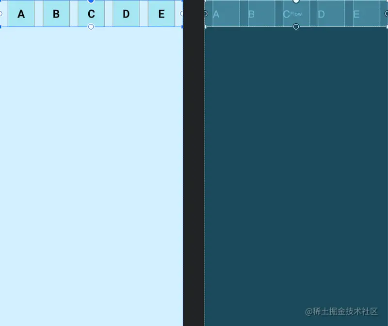
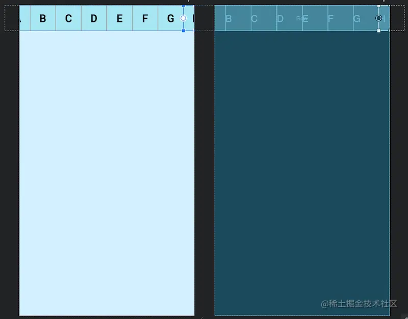
Flow是用于构建链的新虚拟布局,当链用完时可以缠绕到下一行甚至屏幕的另一部分。当您在一个链中布置多个项目时,这很有用,但是您不确定容器在运行时的大小。您可以使用它来根据应用程序中的动态尺寸(例如旋转时的屏幕宽度)构建布局。Flow是一种虚拟布局。在ConstraintLayout中,虚拟布局(Virtual layouts)作为virtual view group的角色参与约束和布局中,但是它们并不会作为视图添加到视图层级结构中,而是仅仅引用其它视图来辅助它们在布局系统中完成各自的布局功能。
下面使用动画来展示Flow创建多个链将布局元素充裕地填充一整行:
我们来看具体的例子:
1
2
3
4
5
6
7
8
9
10
11
12
13
14
15
16
17
18
19
20
21
22
23
24
25
26
27
28
29
30
31
32
33
34
35
36
37
38
39
40
41
42
43
44
45
46
47
48
49
50
51
52
53
54
55
56
57
58
59
60
61
62
63
64
65
66
67
68
69
70
71
72
<?xml version="1.0" encoding="utf-8" ?> <androidx.constraintlayout.widget.ConstraintLayout xmlns:android ="http://schemas.android.com/apk/res/android" xmlns:app ="http://schemas.android.com/apk/res-auto" xmlns:tools ="http://schemas.android.com/tools" android:layout_width ="match_parent" android:layout_height ="match_parent" android:background ="#DAF3FE" tools:context =".MainActivity" tools:ignore ="HardcodedText" > <TextView android:id ="@+id/A" android:layout_width ="60dp" android:layout_height ="60dp" android:background ="@drawable/tv_bg" android:gravity ="center" android:text ="A" android:textColor ="@color/black" android:textSize ="25sp" android:textStyle ="bold" /> <TextView android:id ="@+id/B" android:layout_width ="60dp" android:layout_height ="60dp" android:background ="@drawable/tv_bg" android:gravity ="center" android:text ="B" android:textColor ="@color/black" android:textSize ="25sp" android:textStyle ="bold" /> <TextView android:id ="@+id/C" android:layout_width ="60dp" android:layout_height ="60dp" android:background ="@drawable/tv_bg" android:gravity ="center" android:text ="C" android:textColor ="@color/black" android:textSize ="25sp" android:textStyle ="bold" /> <TextView android:id ="@+id/D" android:layout_width ="60dp" android:layout_height ="60dp" android:background ="@drawable/tv_bg" android:gravity ="center" android:text ="D" android:textColor ="@color/black" android:textSize ="25sp" android:textStyle ="bold" /> <TextView android:id ="@+id/E" android:layout_width ="60dp" android:layout_height ="60dp" android:background ="@drawable/tv_bg" android:gravity ="center" android:text ="E" android:textColor ="@color/black" android:textSize ="25sp" android:textStyle ="bold" /> <androidx.constraintlayout.helper.widget.Flow android:layout_width ="match_parent" android:layout_height ="wrap_content" app:constraint_referenced_ids ="A,B,C,D,E" app:layout_constraintTop_toTopOf ="parent" /> </androidx.constraintlayout.widget.ConstraintLayout >
2.5.1 链约束
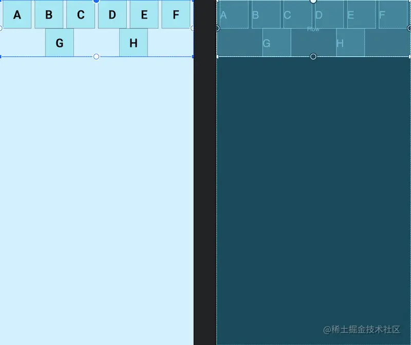
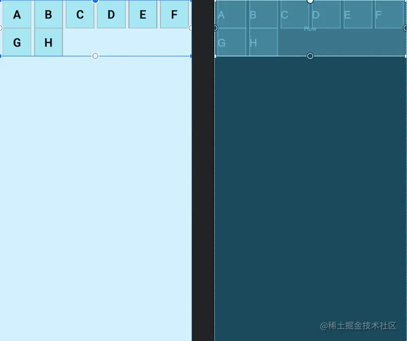

Flow的constraint_referenced_ids关联的控件是没有设置约束的,这一点和普通的链是不一样的,这种排列方式是Flow的默认方式none,我们可以使用app:flow_wrapMode=""属性来设置排列方式,并且我们还可以使用flow_horizontalGap和flow_verticalGap分别设置两个view在水平和垂直方向的间隔,下面我们再添加几个控件来展示三种排列方式:
none(默认值) :所有引用的view形成一条链,水平居中,超出屏幕两侧的view不可见
chian :所引用的view形成一条链,超出部分会自动换行,同行的view会平分宽度。
aligned :所引用的view形成一条链,但view会在同行同列。
下面使用动画来展示三种效果的变化
当flow_wrapMode的值是chian或aligned时,我们还可以针对不同的链进行配置,这里就不一一展示效果了,具体的属性如下:
1 2 3 4 5 6 7 app:flow_horizontalStyle ="packed|spread|spread_inside" 所有水平链的配置 app:flow_verticalStyle ="packed|spread|spread_inside" 所有垂直链的配置 app:flow_firstHorizontalStyle ="packed|spread|spread_inside" 第一条水平链的配置,其他条不生效 app:flow_firstVerticalStyle ="packed|spread|spread_inside" 第一条垂直链的配置,其他条不生效 app:flow_lastHorizontalStyle ="packed|spread|spread_inside" 最后一条水平链的配置,其他条不生效 app:flow_lastVerticalStyle ="packed|spread|spread_inside" 最后一条垂直链的配置,其他条不生效
2.5.2 对齐约束
上面展示的都是相同大小的view,那么不同大小view的对齐方式,Flow也提供了相应的属性进行配置(flow_wrapMode="aligned"时,我试着没有效果)
1 2 3 4 5 app:flow_verticalAlign="top|bottom|center|baseline" app:flow_horizontalAlign="start|end|center"
使用flow_verticalAlign时,要求orientation的方向是horizontal,而使用flow_horizontalAlign时,要求orientation的方向是vertical
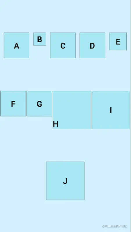
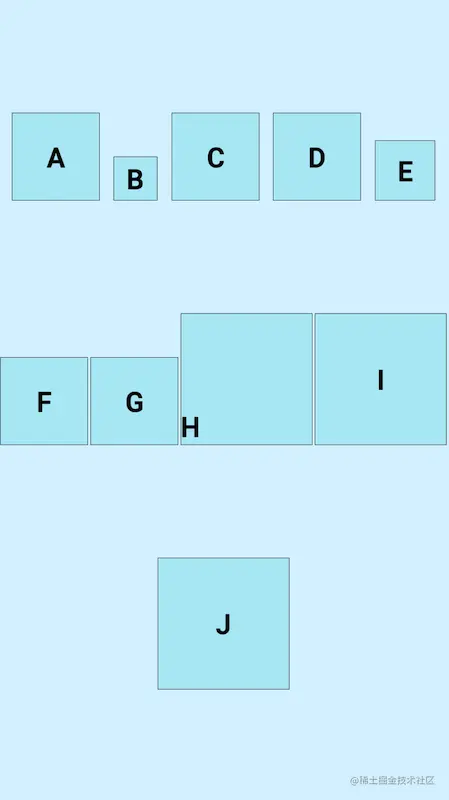
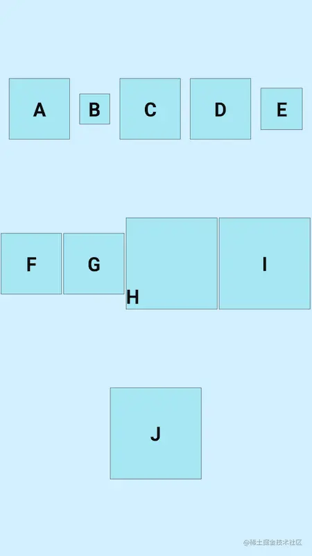
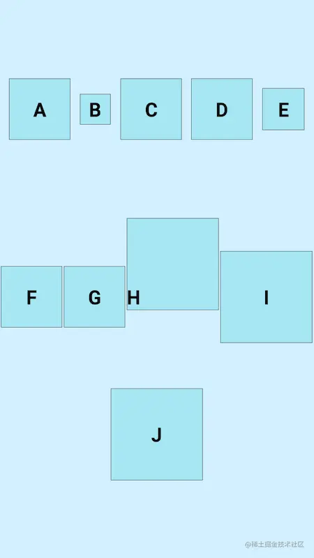
下面展示下各个效果:
horizontal 水平排列
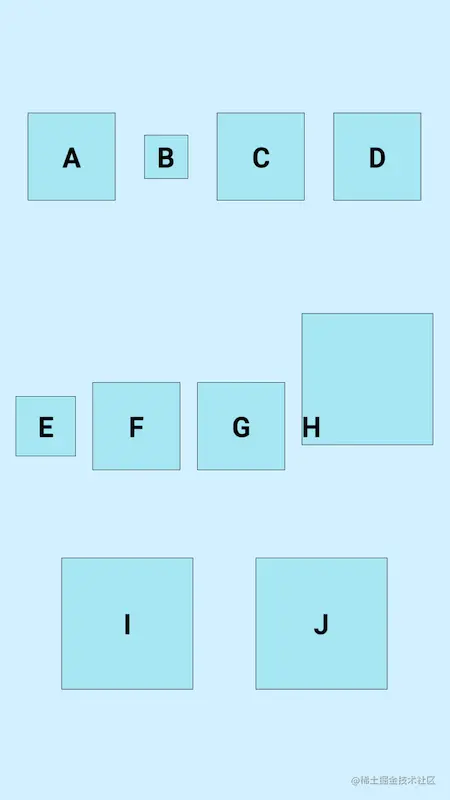
1 2 3 4 5 6 7 8 <androidx.constraintlayout.helper.widget.Flow android:layout_width ="match_parent" android:layout_height ="match_parent" android:orientation ="horizontal" app:constraint_referenced_ids ="A,B,C,D,E,F,G,H,I,J" app:flow_verticalAlign ="top" app:flow_wrapMode ="chain" app:layout_constraintTop_toTopOf ="parent" />
1 2 3 4 5 6 7 8 <androidx.constraintlayout.helper.widget.Flow android:layout_width ="match_parent" android:layout_height ="match_parent" android:orientation ="horizontal" app:constraint_referenced_ids ="A,B,C,D,E,F,G,H,I,J" app:flow_verticalAlign ="bottom" app:flow_wrapMode ="chain" app:layout_constraintTop_toTopOf ="parent" />
1 2 3 4 5 6 7 8 <androidx.constraintlayout.helper.widget.Flow android:layout_width ="match_parent" android:layout_height ="match_parent" android:orientation ="horizontal" app:constraint_referenced_ids ="A,B,C,D,E,F,G,H,I,J" app:flow_verticalAlign ="center" app:flow_wrapMode ="chain" app:layout_constraintTop_toTopOf ="parent" />
1 2 3 4 5 6 7 8 <androidx.constraintlayout.helper.widget.Flow android:layout_width ="match_parent" android:layout_height ="match_parent" android:orientation ="horizontal" app:constraint_referenced_ids ="A,B,C,D,E,F,G,H,I,J" app:flow_verticalAlign ="baseline" app:flow_wrapMode ="chain" app:layout_constraintTop_toTopOf ="parent" />
垂直方向排列这里就不再作过多的展示了
2.5.3 数量约束
当flow_wrapMode属性为aligned和chian时,通过flow_maxElementsWrap属性控制每行最大的子View数量,例如我们设置为flow_maxElementsWrap=4,效果图如下:
2.6 Layer(层布局)
Layer继承自ConstraintHelper,是一个约束助手,相对于Flow来说,Layer的使用较为简单,常用来增加背景,或者共同动画,图层 (Layer) 在布局期间会调整大小,其大小会根据其引用的所有视图进行调整,代码的先后顺序也会决定着它的位置,如果代码在所有引用view的最后面,那么它就会在所有view的最上面,反之则是最下面,在最上面的时候如果添加背景,就会把引用的view覆盖掉,下面展示下添加背景的例子,做动画的例子这里不再展示了
1
2
3
4
5
6
7
8
9
10
11
12
13
14
15
16
17
18
19
20
21
22
23
24
25
26
27
28
29
30
31
32
33
34
35
36
37
38
39
40
41
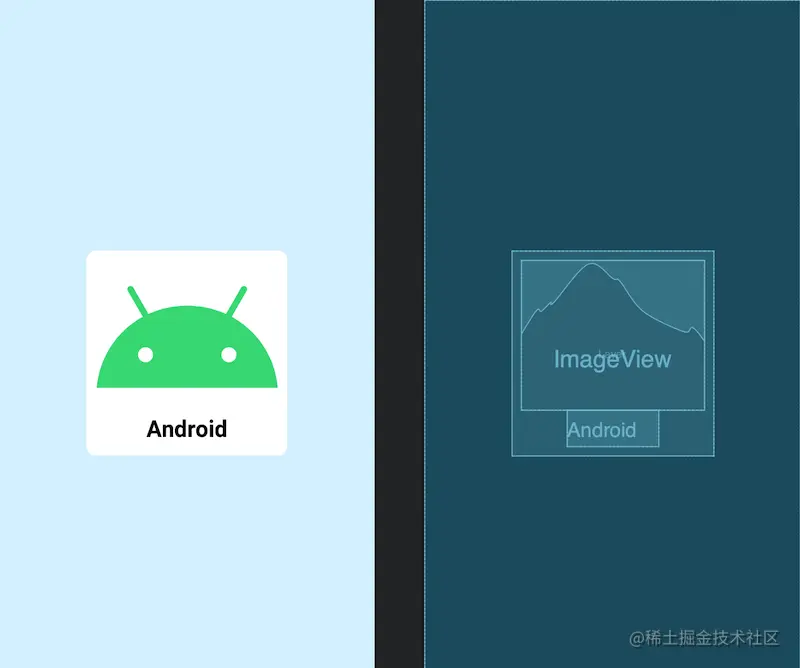
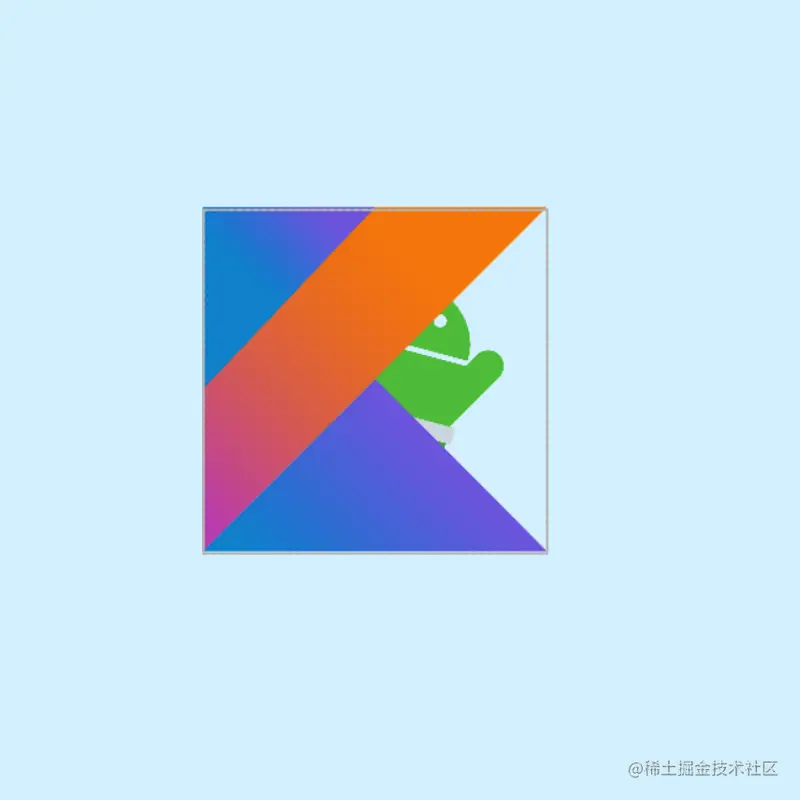
<?xml version="1.0" encoding="utf-8" ?> <androidx.constraintlayout.widget.ConstraintLayout xmlns:android ="http://schemas.android.com/apk/res/android" xmlns:app ="http://schemas.android.com/apk/res-auto" xmlns:tools ="http://schemas.android.com/tools" android:layout_width ="match_parent" android:layout_height ="match_parent" android:background ="#DAF3FE" tools:context =".MainActivity" tools:ignore ="HardcodedText" > <androidx.constraintlayout.helper.widget.Layer android:layout_width ="match_parent" android:layout_height ="match_parent" android:background ="@drawable/common_rect_white_100_10" android:padding ="10dp" app:constraint_referenced_ids ="AndroidImg,NameTv" /> <ImageView android:id ="@+id/AndroidImg" android:layout_width ="200dp" android:layout_height ="wrap_content" android:src ="@drawable/android" app:layout_constraintBottom_toBottomOf ="parent" app:layout_constraintEnd_toEndOf ="parent" app:layout_constraintStart_toStartOf ="parent" app:layout_constraintTop_toTopOf ="parent" /> <TextView android:id ="@+id/NameTv" android:layout_width ="100dp" android:layout_height ="40dp" android:gravity ="center" android:text ="Android" android:textColor ="@color/black" android:textSize ="25sp" android:textStyle ="bold" app:layout_constraintEnd_toEndOf ="@id/AndroidImg" app:layout_constraintStart_toStartOf ="@id/AndroidImg" app:layout_constraintTop_toBottomOf ="@id/AndroidImg" /> </androidx.constraintlayout.widget.ConstraintLayout >
可以看到,当Layer的代码在所有引用view的上面时,效果是正常的,因为此时所有的view都在Layer的上面,下面我们来看一下Layer代码在最后面时的情况:
1
2
3
4
5
6
7
8
9
10
11
12
13
14
15
16
17
18
19
20
21
22
23
24
25
26
27
28
29
30
31
32
33
34
35
36
37
38
39
40
41
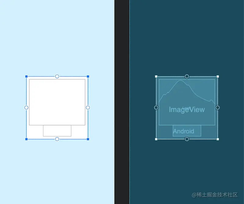
<?xml version="1.0" encoding="utf-8" ?> <androidx.constraintlayout.widget.ConstraintLayout xmlns:android ="http://schemas.android.com/apk/res/android" xmlns:app ="http://schemas.android.com/apk/res-auto" xmlns:tools ="http://schemas.android.com/tools" android:layout_width ="match_parent" android:layout_height ="match_parent" android:background ="#DAF3FE" tools:context =".MainActivity" tools:ignore ="HardcodedText" > <ImageView android:id ="@+id/AndroidImg" android:layout_width ="200dp" android:layout_height ="wrap_content" android:src ="@drawable/android" app:layout_constraintBottom_toBottomOf ="parent" app:layout_constraintEnd_toEndOf ="parent" app:layout_constraintStart_toStartOf ="parent" app:layout_constraintTop_toTopOf ="parent" /> <TextView android:id ="@+id/NameTv" android:layout_width ="100dp" android:layout_height ="40dp" android:gravity ="center" android:text ="Android" android:textColor ="@color/black" android:textSize ="25sp" android:textStyle ="bold" app:layout_constraintEnd_toEndOf ="@id/AndroidImg" app:layout_constraintStart_toStartOf ="@id/AndroidImg" app:layout_constraintTop_toBottomOf ="@id/AndroidImg" /> <androidx.constraintlayout.helper.widget.Layer android:layout_width ="match_parent" android:layout_height ="match_parent" android:background ="@drawable/common_rect_white_100_10" android:padding ="10dp" app:constraint_referenced_ids ="AndroidImg,NameTv" /> </androidx.constraintlayout.widget.ConstraintLayout >
我们可以看到,此时Layer已经把所有的view覆盖住了
ImageFilterButton和ImageFilterView是两个控件,他们之间的关系就和ImageButton与ImageView是一样的,所以这里就只拿ImageFilterView来做讲解。从名字上来看,它们的定位是和过滤有关系的,它们的大致作用有两部分,一是可以用来做圆角图片,二是可以叠加图片资源进行混合过滤,下面一一展示:
2.7.1 圆角图片
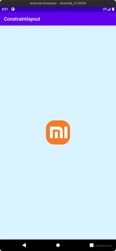
ImageFilterButton和ImageFilterView可以使用两个属性来设置图片资源的圆角,分别是roundPercent和round,roundPercent接受的值类型是0-1的小数,根据数值的大小会使图片在方形和圆形之间按比例过度,round=可以设置具体圆角的大小,我在使用的过程中发现我的AndroidStudio,没有这两个属性的代码提示,也没有预览效果,但是运行起来是有效果的,可能是没有做好优化吧。最近很热门的一个话题,小米花费200万设计的新logo,我们拿来做做例子:
1
2
3
4
5
6
7
8
9
10
11
12
13
14
15
16
17
18
19
20
21
<?xml version="1.0" encoding="utf-8" ?> <androidx.constraintlayout.widget.ConstraintLayout xmlns:android ="http://schemas.android.com/apk/res/android" xmlns:app ="http://schemas.android.com/apk/res-auto" xmlns:tools ="http://schemas.android.com/tools" android:layout_width ="match_parent" android:layout_height ="match_parent" android:background ="#DAF3FE" tools:context =".MainActivity" tools:ignore ="HardcodedText" > <androidx.constraintlayout.utils.widget.ImageFilterView android:layout_width ="100dp" android:layout_height ="100dp" android:src ="@drawable/mi" app:layout_constraintBottom_toBottomOf ="parent" app:layout_constraintEnd_toEndOf ="parent" app:layout_constraintStart_toStartOf ="parent" app:layout_constraintTop_toTopOf ="parent" app:roundPercent ="0.7" /> </androidx.constraintlayout.widget.ConstraintLayout >
虽然和小米新logo的圆弧不太一样,不过这也不是我们考虑的地方,可以看到我们使用roundPercent设置了圆角为0.7(70%),实现一个圆角图片就是如此简单。
2.7.2 图片过滤
ImageFilterButton和ImageFilterView不但可以使用src来设置图片资源,还可以使用altSrc来设置第二个图片资源,altSrc提供的资源将会和src提供的资源通过crossfade属性形成交叉淡化效果,默认情况下,crossfade=0,altSrc所引用的资源不可见,取值在0-1。下面看例子:
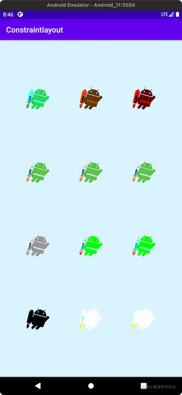
除此之外,warmth属性可以用来调节色温,brightness属性用来调节亮度,saturation属性用来调节饱和度,contrast属性用来调节对比度,下面展示一下各自属性和取值的效果:
1
2
3
4
5
6
7
8
9
10
11
12
13
14
15
16
17
18
19
20
21
22
23
24
25
26
27
28
29
30
31
32
33
34
35
36
37
38
39
40
41
42
43
44
45
46
47
48
49
50
51
52
53
54
55
56
57
58
59
60
61
62
63
64
65
66
67
68
69
70
71
72
73
74
75
76
77
78
79
80
81
82
83
84
85
86
87
88
89
90
91
92
93
94
95
96
97
98
99
100
101
102
103
104
105
106
107
108
109
110
111
112
113
114
115
116
117
118
119
120
121
122
123
124
125
126
127
128
129
130
131
132
133
134
135
136
137
138
139
140
141
142
143
144
145
146
147
148
149
150
151
152
153
154
155
156
157
158
159
160
161
162
<?xml version="1.0" encoding="utf-8" ?> <androidx.constraintlayout.widget.ConstraintLayout xmlns:android ="http://schemas.android.com/apk/res/android" xmlns:app ="http://schemas.android.com/apk/res-auto" xmlns:tools ="http://schemas.android.com/tools" android:layout_width ="match_parent" android:layout_height ="match_parent" android:background ="#DAF3FE" tools:context =".MainActivity" tools:ignore ="HardcodedText" > <androidx.constraintlayout.utils.widget.ImageFilterView android:id ="@+id/view1" android:layout_width ="80dp" android:layout_height ="80dp" android:src ="@drawable/jetpack" app:layout_constraintBottom_toBottomOf ="@id/view2" app:layout_constraintEnd_toStartOf ="@+id/view2" app:layout_constraintHorizontal_bias ="0.5" app:layout_constraintStart_toStartOf ="parent" app:layout_constraintTop_toTopOf ="@id/view2" app:warmth ="0" /> <androidx.constraintlayout.utils.widget.ImageFilterView android:id ="@+id/view2" android:layout_width ="80dp" android:layout_height ="80dp" android:src ="@drawable/jetpack" app:layout_constraintBottom_toTopOf ="@+id/view5" app:layout_constraintEnd_toStartOf ="@+id/view3" app:layout_constraintHorizontal_bias ="0.5" app:layout_constraintStart_toEndOf ="@+id/view1" app:layout_constraintTop_toTopOf ="parent" app:warmth ="5" /> <androidx.constraintlayout.utils.widget.ImageFilterView android:id ="@+id/view3" android:layout_width ="80dp" android:layout_height ="80dp" android:src ="@drawable/jetpack" app:layout_constraintBottom_toBottomOf ="@id/view2" app:layout_constraintEnd_toEndOf ="parent" app:layout_constraintHorizontal_bias ="0" app:layout_constraintStart_toEndOf ="@+id/view2" app:layout_constraintTop_toTopOf ="@id/view2" app:warmth ="9" tools:layout_editor_absoluteY ="0dp" /> <androidx.constraintlayout.utils.widget.ImageFilterView android:id ="@+id/view4" android:layout_width ="80dp" android:layout_height ="80dp" android:src ="@drawable/jetpack" app:brightness ="0" app:layout_constraintBottom_toBottomOf ="@id/view5" app:layout_constraintEnd_toStartOf ="@+id/view5" app:layout_constraintHorizontal_bias ="0.5" app:layout_constraintStart_toStartOf ="parent" app:layout_constraintTop_toTopOf ="@id/view5" tools:layout_editor_absoluteY ="136dp" /> <androidx.constraintlayout.utils.widget.ImageFilterView android:id ="@+id/view5" android:layout_width ="80dp" android:layout_height ="80dp" android:src ="@drawable/jetpack" app:brightness ="5" app:layout_constraintBottom_toTopOf ="@+id/view8" app:layout_constraintEnd_toStartOf ="@+id/view6" app:layout_constraintHorizontal_bias ="0.5" app:layout_constraintStart_toEndOf ="@+id/view4" app:layout_constraintTop_toBottomOf ="@+id/view2" /> <androidx.constraintlayout.utils.widget.ImageFilterView android:id ="@+id/view6" android:layout_width ="80dp" android:layout_height ="80dp" android:src ="@drawable/jetpack" app:brightness ="9" app:layout_constraintBottom_toBottomOf ="@id/view5" app:layout_constraintEnd_toEndOf ="parent" app:layout_constraintHorizontal_bias ="0.5" app:layout_constraintStart_toEndOf ="@+id/view5" app:layout_constraintTop_toTopOf ="@id/view5" tools:layout_editor_absoluteY ="136dp" /> <androidx.constraintlayout.utils.widget.ImageFilterView android:id ="@+id/view7" android:layout_width ="80dp" android:layout_height ="80dp" android:src ="@drawable/jetpack" app:layout_constraintBottom_toBottomOf ="@id/view8" app:layout_constraintEnd_toStartOf ="@+id/view8" app:layout_constraintHorizontal_bias ="0.5" app:layout_constraintStart_toStartOf ="parent" app:layout_constraintTop_toTopOf ="@id/view8" app:saturation ="0" tools:layout_editor_absoluteY ="285dp" /> <androidx.constraintlayout.utils.widget.ImageFilterView android:id ="@+id/view8" android:layout_width ="80dp" android:layout_height ="80dp" android:src ="@drawable/jetpack" app:layout_constraintBottom_toTopOf ="@+id/view11" app:layout_constraintEnd_toStartOf ="@+id/view9" app:layout_constraintHorizontal_bias ="0.5" app:layout_constraintStart_toEndOf ="@+id/view7" app:layout_constraintTop_toBottomOf ="@+id/view5" app:saturation ="5" /> <androidx.constraintlayout.utils.widget.ImageFilterView android:id ="@+id/view9" android:layout_width ="80dp" android:layout_height ="80dp" android:src ="@drawable/jetpack" app:layout_constraintBottom_toBottomOf ="@id/view8" app:layout_constraintEnd_toEndOf ="parent" app:layout_constraintHorizontal_bias ="0.5" app:layout_constraintStart_toEndOf ="@+id/view8" app:layout_constraintTop_toTopOf ="@id/view8" app:saturation ="9" tools:layout_editor_absoluteY ="296dp" /> <androidx.constraintlayout.utils.widget.ImageFilterView android:id ="@+id/view10" android:layout_width ="80dp" android:layout_height ="80dp" android:src ="@drawable/jetpack" app:contrast ="0" app:layout_constraintBottom_toBottomOf ="@id/view11" app:layout_constraintEnd_toStartOf ="@+id/view11" app:layout_constraintHorizontal_bias ="0.5" app:layout_constraintStart_toStartOf ="parent" app:layout_constraintTop_toTopOf ="@id/view11" tools:layout_editor_absoluteY ="437dp" /> <androidx.constraintlayout.utils.widget.ImageFilterView android:id ="@+id/view11" android:layout_width ="80dp" android:layout_height ="80dp" android:src ="@drawable/jetpack" app:contrast ="5" app:layout_constraintBottom_toBottomOf ="parent" app:layout_constraintEnd_toStartOf ="@+id/view12" app:layout_constraintHorizontal_bias ="0.5" app:layout_constraintStart_toEndOf ="@+id/view10" app:layout_constraintTop_toBottomOf ="@+id/view8" /> <androidx.constraintlayout.utils.widget.ImageFilterView android:id ="@+id/view12" android:layout_width ="80dp" android:layout_height ="80dp" android:src ="@drawable/jetpack" app:contrast ="9" app:layout_constraintBottom_toBottomOf ="@id/view11" app:layout_constraintEnd_toEndOf ="parent" app:layout_constraintHorizontal_bias ="0.5" app:layout_constraintStart_toEndOf ="@+id/view11" app:layout_constraintTop_toTopOf ="@id/view11" tools:layout_editor_absoluteY ="437dp" /> </androidx.constraintlayout.widget.ConstraintLayout >
2.8 MockView
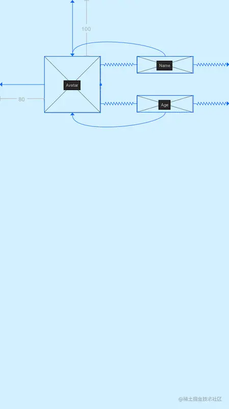
你家产品经理经常会给你画原型图,但这绝对不是他们的专属,我们也有自己的原型图,一个成熟的程序员要学会给自己的产品经理画大饼,我们可以使用MockView来充当原型图,下面看例子:
1
2
3
4
5
6
7
8
9
10
11
12
13
14
15
16
17
18
19
20
21
22
23
24
25
26
27
28
29
30
31
32
33
34
35
36
<?xml version="1.0" encoding="utf-8" ?> <androidx.constraintlayout.widget.ConstraintLayout xmlns:android ="http://schemas.android.com/apk/res/android" xmlns:app ="http://schemas.android.com/apk/res-auto" xmlns:tools ="http://schemas.android.com/tools" android:layout_width ="match_parent" android:layout_height ="match_parent" android:background ="#DAF3FE" tools:context =".MainActivity" tools:ignore ="HardcodedText" > <androidx.constraintlayout.utils.widget.MockView android:id ="@+id/Avatar" android:layout_width ="100dp" android:layout_height ="100dp" android:layout_marginStart ="80dp" android:layout_marginTop ="100dp" app:layout_constraintStart_toStartOf ="parent" app:layout_constraintTop_toTopOf ="parent" /> <androidx.constraintlayout.utils.widget.MockView android:id ="@+id/Name" android:layout_width ="100dp" android:layout_height ="30dp" app:layout_constraintEnd_toEndOf ="parent" app:layout_constraintStart_toEndOf ="@id/Avatar" app:layout_constraintTop_toTopOf ="@id/Avatar" /> <androidx.constraintlayout.utils.widget.MockView android:id ="@+id/Age" android:layout_width ="100dp" android:layout_height ="30dp" app:layout_constraintBottom_toBottomOf ="@id/Avatar" app:layout_constraintEnd_toEndOf ="parent" app:layout_constraintStart_toEndOf ="@id/Avatar" /> </androidx.constraintlayout.widget.ConstraintLayout >
2.9 ConstraintProperties(流式API)
2.0 提供了ConstraintProperties可以使用流式 API修改属性
1
2
3
4
val properties = ConstraintProperties(findViewById(R.id.image)) properties.translationZ(32f ) .margin(ConstraintSet.START, 43 ) .apply()
转载声明:本文转载自稀土掘金作者 Glim 的《万字长文 - 史上最全ConstraintLayout(约束布局)使用详解 》,原文发布于 2021-04-09,版权归原作者所有。